Running with Chisels Vol. 14
Marquetry tips
Browse by Category:
Welcome
Our corner of the internet dedicated to decorated furniture
#saynotonakedfurniture
#dressyourfurniture
rwc archive
tools
classes
Vol 14 | July 26, 2024
Greetings fellow Marquetarians and other people with a veneer of respectability! I hope that your summer (or winter, for those in the Southern hemisphere) is proceeding as well as you’d like. It’s a tad warm here, so I have been trying to spend as much time as I can in my shop. I’ll take any excuse to be in there.
As I mentioned in the RWC Vol.12, I had a major failure in a marquetry tabletop that I was making. I started again, and here it is today:
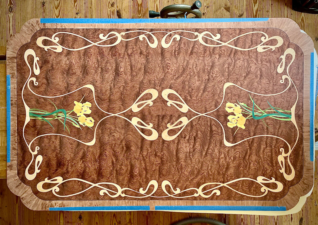
I inlaid every piece into the bubinga background that I first glued to the substrate. It took a while but it looks as it should. I am pleased, and I learned that sometimes the longest way is the only way. Sigh. I am now working on the non-marquetry parts of the table, so the solid wood edging for the table, and the base.
I spoke about using veneer in traditional furniture at the SAPFM Annual Conference at Ursinus College near Philly on June 30. Many of the attendees are already converts, so this was a supportive audience. I also demonstrated radial veneering at the Chesapeake SAPFM meeting on July 13, at the Rockler in Fairfax VA.
I will be teaching at Sam Beauford Woodworking Institute in Adrian MI on Aug 12-16 and Aug 17-18, and the Wood and Shop in Earlysville VA on Sept 12-13. Classes in my shop start up again Sept 7, but there are only a few spots open for the balance of the year (thank you to everyone that has taken a class from me). I will get the first half of 2025 organized soon and you folks will be the first to know when new classes are posted.
In this edition of Running with Chisels:
- Ask Dave: How to create a line drawing from a photo step by step
- Tech(nique) Topic: Designing a 4-way panel match
Ask Dave: How do you turn a photo into a marquetry pattern? Is there specific software you use?
A:
As an Engineer, I have found that the best way to create a quality marquetry picture is to have a family member or close friend that is an artist (not a joke.). Ask for a line drawing of the subject that you are interested in. Then the drawing needs to be reviewed for cuttability, since things are possible with a pen that wood cannot support. Most of my best work was designed that way.
When forced to create my own line drawings, I use a computer only for cleanup. I do not have software that specifically turns photos into patterns and I am not familiar with them, though they exist. I use Photoshop to manipulate pictures because I already know how to use it. It is the most unfriendly program that I have used, but I’ve been using it for many years so I’ve gotten used to its quirks. I use it to adjust proportions and add elements from other pictures if needed. I sometimes use the posterize feature to see where it sees the divisions between the pieces, but mostly I do it by eye. (We did also review some of these features in RWC 10)

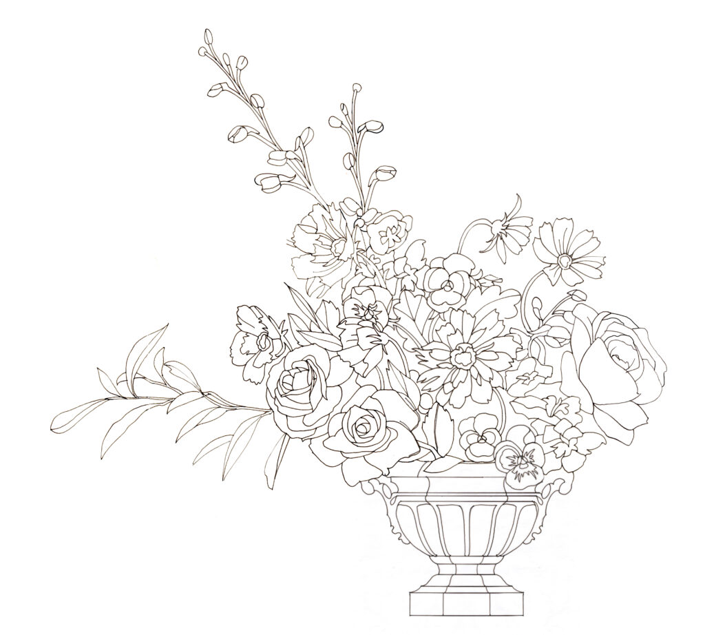
I see a composition as having levels, and I draw it that way, even from a photo. First I focus on the edges of the objects. Once I’m satisfied with them, I clarify the critical focus areas. Once I have them defined, I add other details until the picture looks balanced.
Here are the mechanical steps I use to create a marquetry pattern from a photo or complex image:
1. I print the picture as large as I can. If the colors are too dark I might reduce the intensity and increase the contrast so that the edges are clearer. I often print it in grayscale for clarity. My most important tool is a light table. I set the photo on the table and tracing paper on top. I also display the same image on my computer screen, directly behind the light table. I trace the picture, exterior and all interior edges using the table, using a 0.5 mm mechanical pencil. Whenever I am confused I look up at the same photo on the computer screen to clarify what I am looking at through the tracing paper.
2. Once I’ve got the shapes outlined that way I study the tracing paper alone to see what elements are missing, first focusing on the shapes, then the details. Once I like it I set it aside and look at it tomorrow, looking at it with fresh eyes to only see what the lines on the page show, rather than the image in my head.
3. Once I like it I scan it into the computer and clean it up in Photoshop. Often I print it again, large, and trace with a fine tipped pen to get crisper narrow lines. If there are geometric shapes involved I may use French curves when I do the redraw to get the shapes taut. You can always loosen them while cutting, but tightening is hard. French curves are a great tool for creating flowing elegant shapes, but it’s not quick. I often change the relative sizes of components at this point – the crispness and lack of detail make the proportions clear, and any imbalances step forward. Fix them now – it only gets worse later. Once I have the drawing tight I scan it back into the computer again, reassembling the picture if it was on multiple pages, since my scanner is 8 1/2″ x 11″.
4. If I want very fine lines I use Adobe Illustrator after finishing with Photoshop. I know little about that program but I have cheat sheets from my daughter the Architect that allow me to do a few things, making 0.25 pixel lines among them. It can also be used to smooth curves but I have forgotten how to do that. If anyone is interested in learning how Jenn would use the LiveTrace feature in Adobe Illustrator, email us. Be warned that we both use Adobe CS5, which we already owned, because the Adobe subscription model is outrageous for the occasional user.
I suspect that there are newer and more friendly programs that would do these things but I still use the Adobe suite I bought in 2010 on my old computer, which I keep specifically for that software.
If I am creating a pattern by combining elements from several pictures, or from looking at an object, I focus on the outlines of the shapes first, and arranging those shapes pleasingly, using pencil and paper . Only once the composition seems acceptable do I develop any interior details. If I have developed an area then decide that the scale or composition is wrong, Photoshop can be used to break the picture up into chunks ( which it calls layers). Each can be manipulated separately then the elements rearranged. This is quite a time saver vs redrawing each of the areas.
I recently took a marquetry class from Silas Kopf, and his fluency drawing and designing was humbling. This is an opportunity area for me. From watching him and other artists work, computers are convenient for scaling and storing work, but a pencil and paper are the critical tools, and practice is the best way to improve.
Tech(nique) Topic: Designing a 4-way panel match in marquetry
I discussed designing four way matches at the SAPFM conference recently, and this is the heart of that talk.
In the “Ask Dave” I talk about designing a marquetry picture. The computer plays a supporting role in that work. One place where the computer shines is in visualizing a four way (or a radial ) match. I showed this to a younger student who was able to replicate this technique on a phone. I cannot do that and I don’t want to. My 34” monitor suits my style better than a phone screen, but you should use whatever tools best suit your skills.
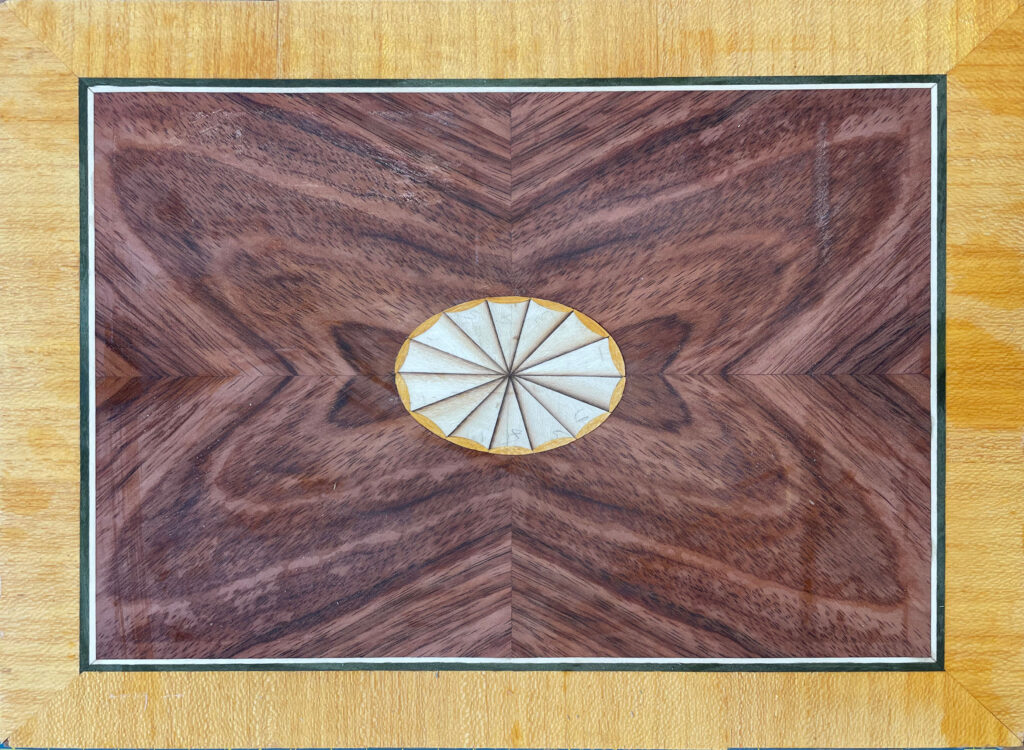
We want to make a four way match panel such as shown in Fig 1. It will have four bookmatched pieces of veneer with a center oval, and two layers of edging. Let’s assume that the panel size is defined, maybe for a table top or a panel in a door. We have 4 consecutive sheets of veneer bigger than required. We want to draw the overall pattern so that we know the size of the four main pieces. We will then use that information to help select which part of the veneer sheets will be in our pattern.
Determine the edge banding width. 1” looks nice. If the panel will be in a frame, add that to the edge width, so 1 ¼” for a one inch visible edge. I draw that onto the panel that I have cut to the required size. I then draw on the fillet/narrow banding, generally 2-6 mm. Yes, I just mixed my measurement systems. What is left is the main panel. I divide that into four quadrants.
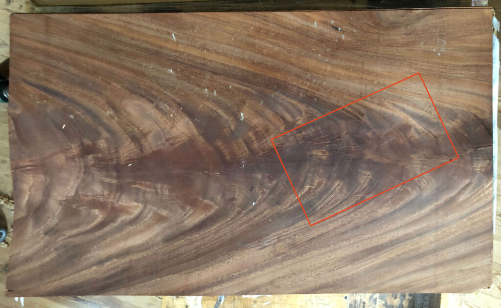
I then cut a hole in a piece of paper, exactly the size of a quadrant. This is the window that we will use to select our target area on each sheet. Fig 2 shows a flitch of mahogany crotch veneer. I place the piece of paper on the veneer so that some interesting features are visible. Fig. 3 shows an example selection, from the veneer sheet in Fig. 2.
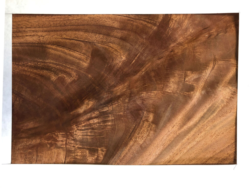
I take the selected quadrant image, Fig. 3 and load it into photo editing software. I use Photoshop because I have it and I know how to use it. Other software is definitely easier to use. Use what you know.
I am going to make a four way match, using four sequential slices of veneer, so the pattern on each will be (almost) identical. From these four pieces of veneer, I can generate four very different patterns, depending on which of the four corners goes into the center.
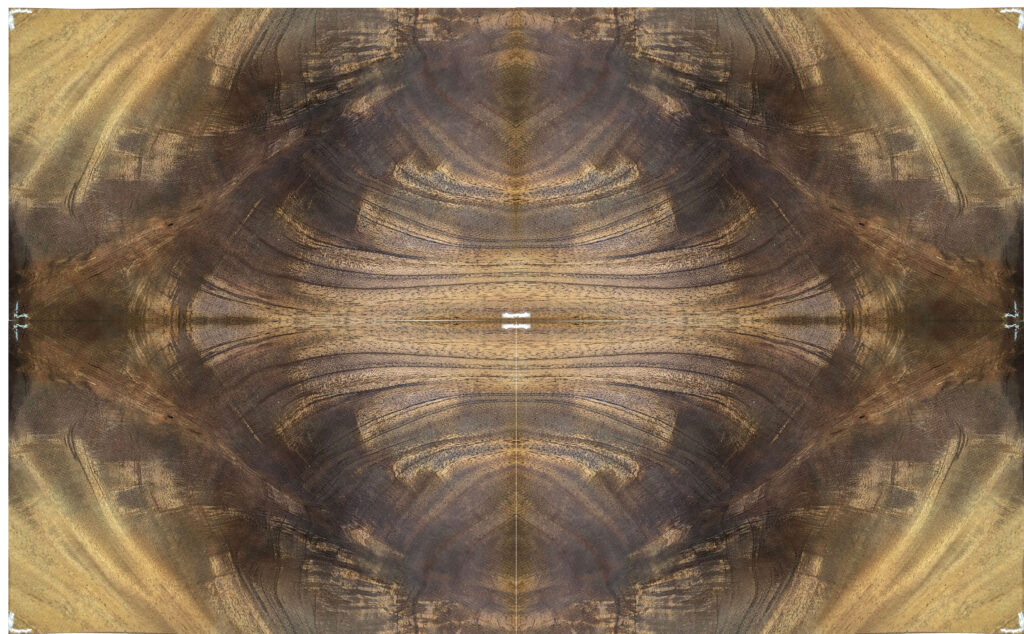
Fig. 4 above is generated by placing the top left corner of Fig.3 in the center. There is a lot going on in the center, and there will be an oval covering some of that. There is also weirdness in the corners.
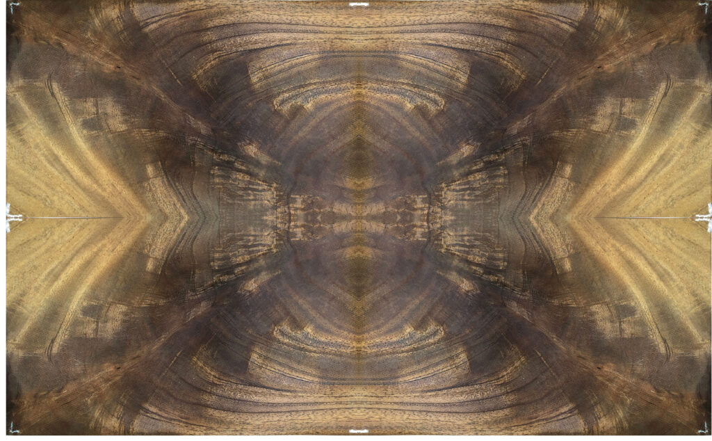
Fig. 5 has the bottom left corner in the center. It has the exploding star look rather than the surrounding diamond that the previous picture had. I like it better than Fig. 4
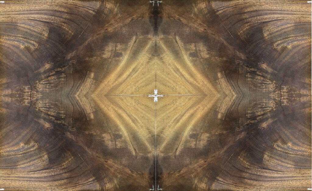
Fig. 6 has the lower right corner in the center. It is crazy in the center, but that will have the fan to calm it. The surrounding diamond is intense and dramatic. I love it. A winner! I like it so much that I don’t even bother looking at the fourth alternative.
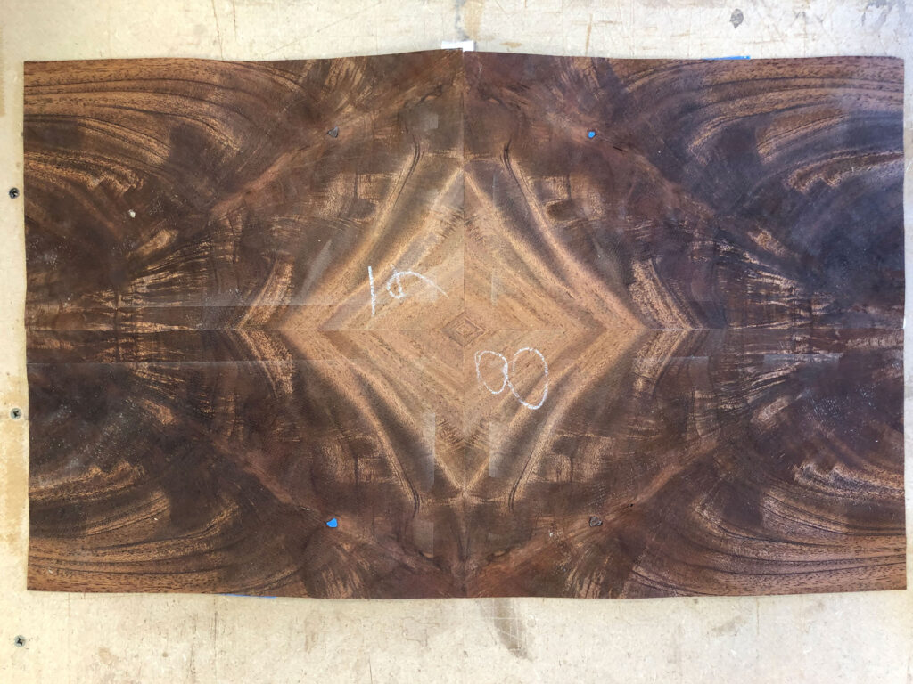
Fig. 7 shows the actual 4 way match pattern using the sequential sheets of veneer, as opposed to Fig. 6, which is generated in Photoshop. They look remarkably similar, which is comforting.
I am always open to finding a cool pattern and going with it. Maybe the last pattern would have been even better, but I doubted it at the time and I don’t feel the need. Excellent is excellent, and doesn’t need to be better than that. This is part of my personality. I encourage you to follow your own inspirations, which can and should be very different from mine. That is how we can all make wonderful but different things starting with similar materials.
As Chris Schwarz says, “Disobey me.”
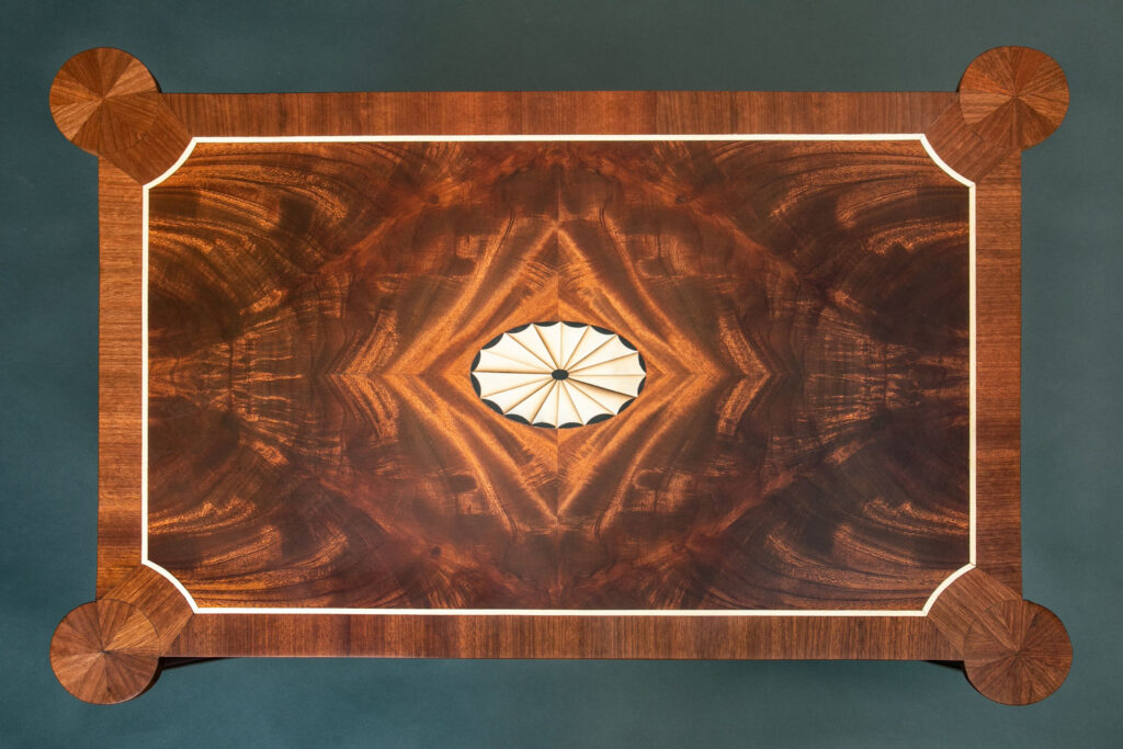
Just to finish off the story, above we have the completed table top. It had a few other complications – the round corners were a pain. However, the heart of the top is the four way match we just discussed. I love the way the lighter colored stripes surround the oval, and the rest of the top looks like boiling chocolate.
Newsletter Archive: My fearless webmaster/daughter Jennifer has created a index page for all of the old newsletters. It is : https://rwc.hellerandhellerfurniture.com . If you want to read or re-read something, all of the pearls of wisdom are hidden there among all of the other stuff I write. I published a list of the basic marquetry tool kit last year, and I will update it for the next newsletter to include a wider array of useful things for the various kinds of veneer and marquetry work that I practice.
Take care, have fun and keep making stuff. And Say no to naked furniture.
return to the running with chisels archive
return to top
©️ 2025 Heller & Heller Furniture | Privacy Policy | Terms