Running with Chisels Vol. 10
Marquetry tips
Browse by Category:
Welcome
Our corner of the internet dedicated to decorated furniture
#saynotonakedfurniture
#dressyourfurniture
rwc archive
tools
classes
Vol 10. | Feb. 23, 2024
Welcome to Running With Chisels, or welcome back!
This month and into March Dave is teaching back to back to back to back, so expect some interesting tips to come out of all that hands-on instruction. With all that teaching comes a little less time for ruminating on design, so this month daughter Jenn “the other Heller” is stepping in to share a little of her multi-disciplinary design inspiration expertise in the tech topic.
In case you haven’t heard Dave’s bragging recently or ever, a little background: Jenn is a classically-trained architect with a furniture concentration component to her degree, and the recipient of the furniture award upon graduation. She was recently featured as one of 7 outstanding alumnae after 50 years of the furniture concentration at Notre Dame, and her writing desk and chair won Best in Show at a juried art exhibition in 2008. She went on to work in London and DC before shifting gears to residential design and more detailed personal solutions. In the middle she also operated a boutique wedding stationery and art business featuring her watercolor work, and now she is a full-time artist and accidental flower farmer in Central Virginia. You may have seen her design work around here recently on the collaboration piece.
In this edition of Running with Chisels:
- Ask Dave: How to create a line drawing from a photo
- Decorative Arts Museums: the MAK
- History: Who is the Roentgen guy anyway?
- Tech(nique) Topic: Where do design ideas come from?
Ask Dave: How to create a line drawing from a photo?
A reader says: Something I struggle with is coming up with a line drawing from a photo, mainly trying to determine logical points of when/where to change veneers is a struggle. I don’t know if you have a methodology or can offer insight in a future letter, or if it’s just intuition gained with experience.
A: This is a great question because the answer is both technical and artistic! Jenn is going to start, with the artsy stuff:
Foremost, I believe you are asking about the actual technical process of creating a line drawing from a more complex image that likely contains many smooth gradations: choosing what to leave in, what to exclude. As you note, choosing where to switch veneers is as important as the physical task of representing that line drawing in marquetry.
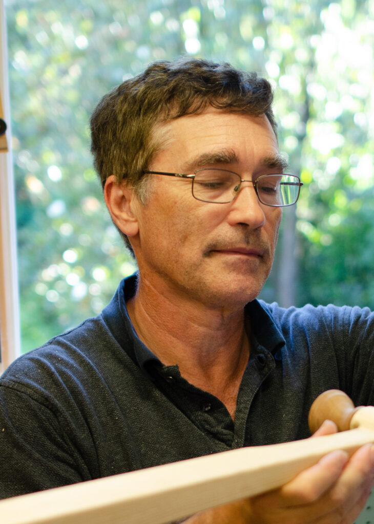
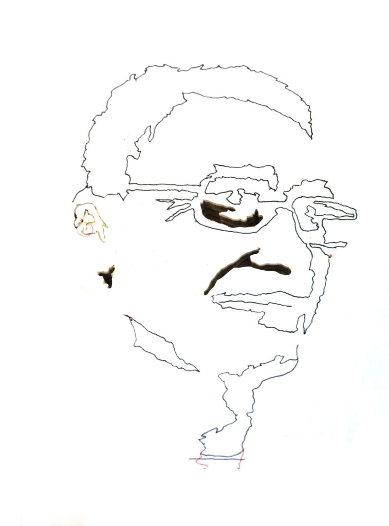
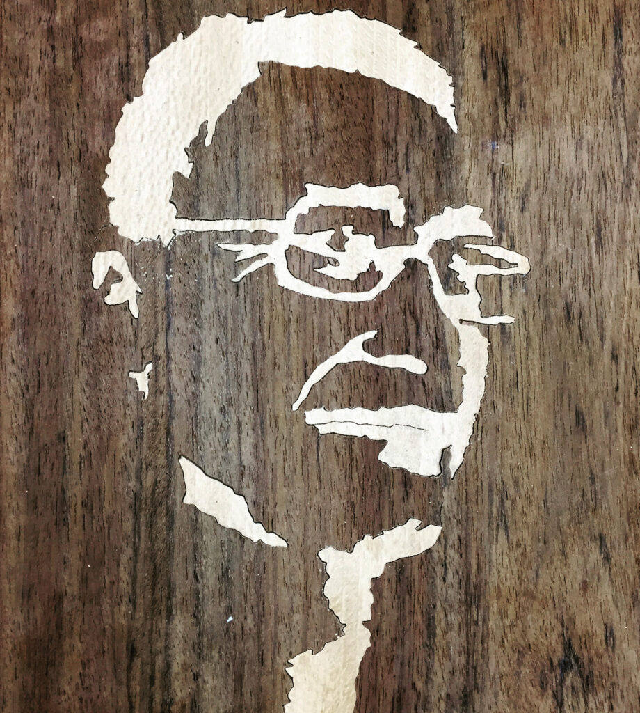
To help you simplify and begin to draw a complex picture, the starting point for most artists is the same no matter the art medium: don’t allow your visual brain filter to interpret what your eyes are seeing, so you can focus on what is actually there. In “normal” seeing your brain helps you by adding and dropping details, interpreting your vision so that you can quickly process it and act (and not get eaten by bears,or fall off a cliff…). When seeing artistically, you want the raw un-interpreted picture to translate to the line drawing. This way of seeing allows you to focus on more abstracted shapes as they actually are, and not become fixated on the idea that you know that curve is part of an apple, etc.
Often artists will do this by squinting, or forcing their eyes slightly out of focus, so that the strongest contrasts are visible but the granular details are removed. You can also can use layers of trace paper as an overlay to your advantage – each layer of trace will remove a level of detail from what you can see underneath. You can also try turning off your brain’s interpretive assistance by drawing upside-down!
If you have access to digital imaging software, like Photoshop, there is an additional tool you can use to simplify your image into “layers” which actually is ideal for something like marquetry:

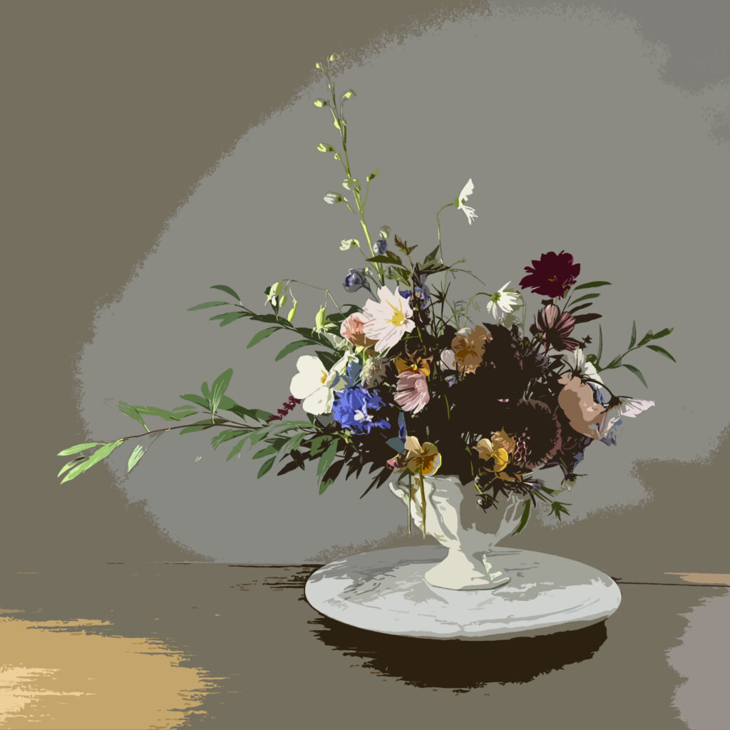
The instructions will vary based on what software you’re using, but this example is produces in Photoshop Elements using the Filter < Artistic < Cutout tool. You can adjust the details from there based on your preference but you can already see the difference it makes in simplifying the image and allowing you to see details. There are several different ways to do this in Photoshop or similar so this is just one example, but it works.
Once you have this simplified version, the next part of the process is to apply your own interpretation to emphasize your design. Dave is going to take over here with his thoughts:
As you set up your picture, you should be intentionally guiding where you want the viewer to focus through your choices of piece size and shape. The contrast and complexity need to be highest in the main focus of the picture, with visual tie-ins to lead your eye from other areas to that focal area. Smaller pieces and more pieces catch the eye. A flower at the edge of the bouquet may have 8 petals, and the focal flower has 40. Sand shading or high contrast woods complement that approach. Try drawing a couple of areas at differing levels of detail. Which appeal to you more?
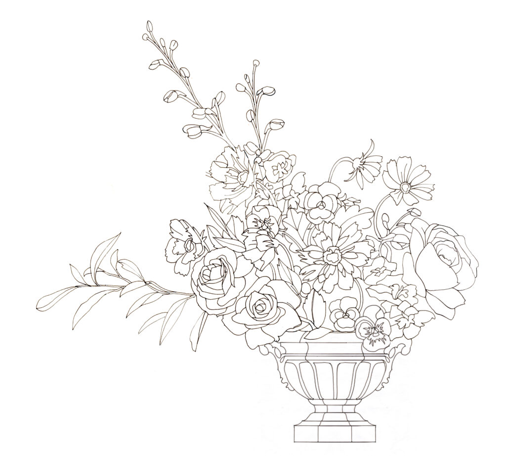
As you design more pictures, your style surfaces. In my case, this was completely unintentional. Almost ten years ago I was packet cutting, just trying to make marquetry stuff for my new craft show business. I knew that fewer pieces in a picture meant that I could finish faster, which meant I would have more pictures to sell and I could sell them for less. A lower price point is generally good at craft shows. My panels always had at least 40 pieces, no matter how I tried. If they had fewer I didn’t like them. I realized that my eye demands a certain level of complexity. It wasn’t coming from the images I started from, it was me!
When I look back on my early work, they were all designed and made by a single artist (me.) This cohesiveness is good, but growth requires challenging assumptions, among them how I design. That is why last Fall’s collaboration piece was so beneficial to me – I didn’t design it, so it stretched me in ways I didn’t realize I’d been limiting. I preferred the result, so now I need to make sure that I don’t self-impose limits.
Lastly, a note on construction because we’re not designing in abstract: I don’t like pieces less than 3 mm around, unless it’s an eye. If you make tiny pictures, that is your life. I don’t. Veneer prefers to be at least 2 mm wide , and 3 mm is much easier. Those dimensions cross grain are asking for trouble.
Decorative Arts Museums: the MAK in Vienna, Austria
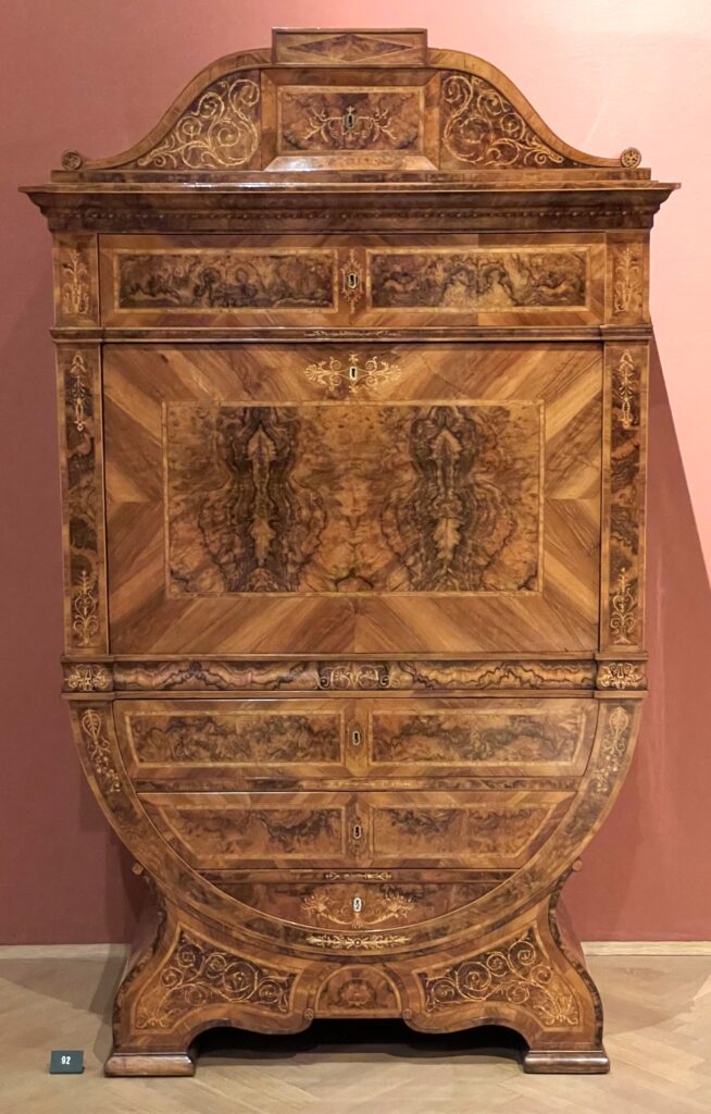
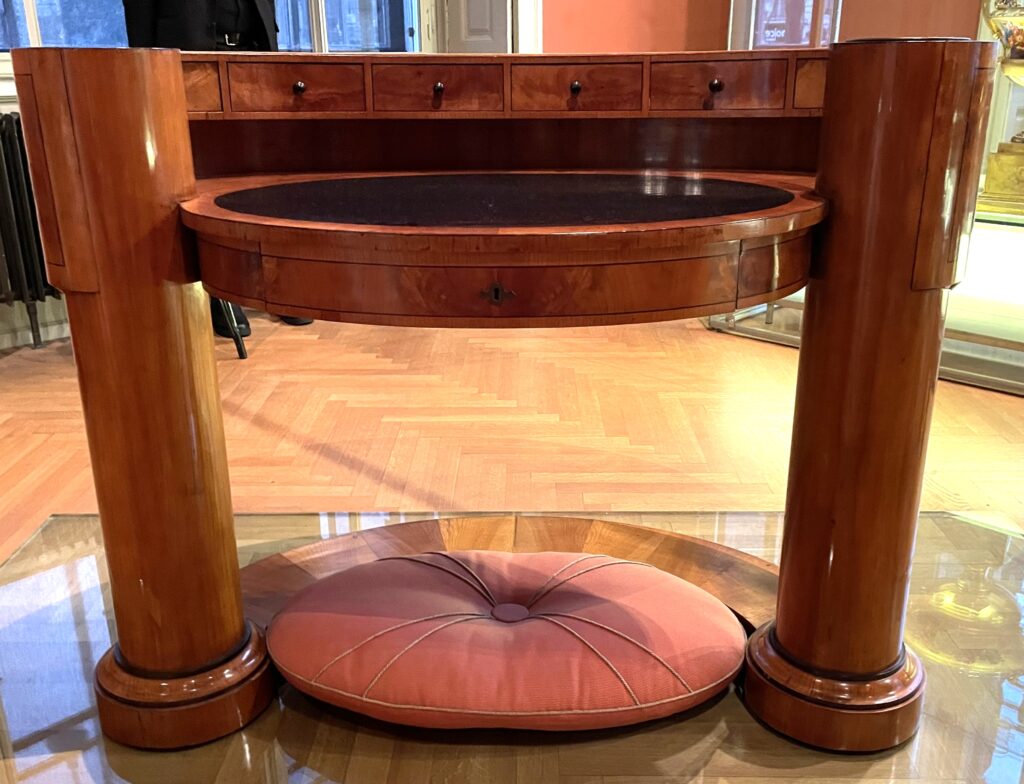
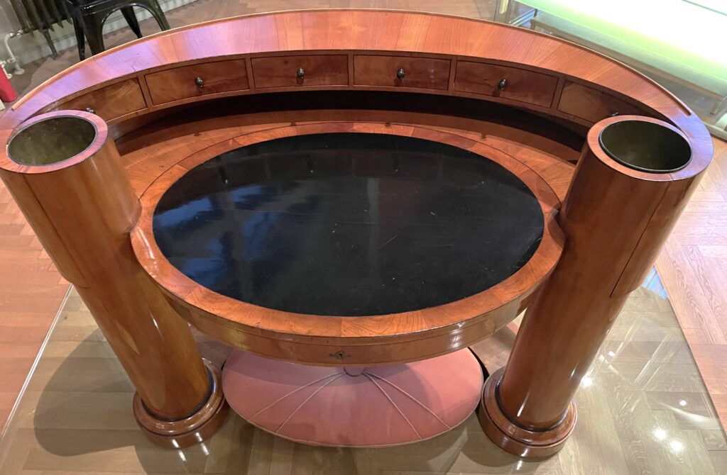
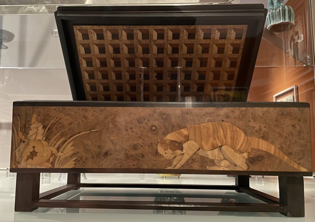
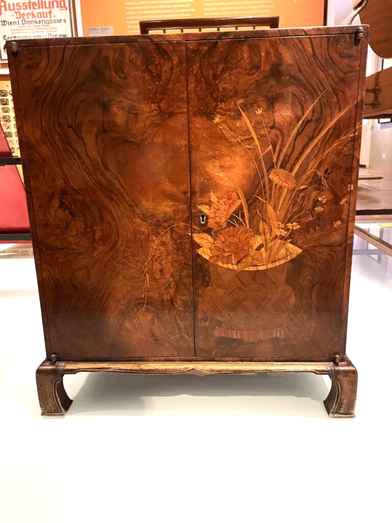
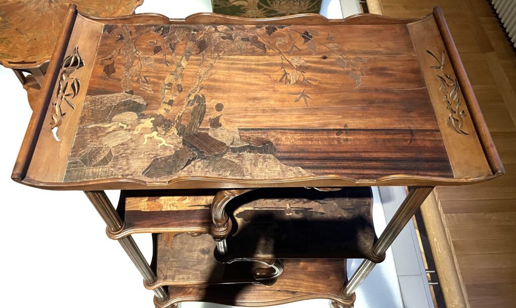
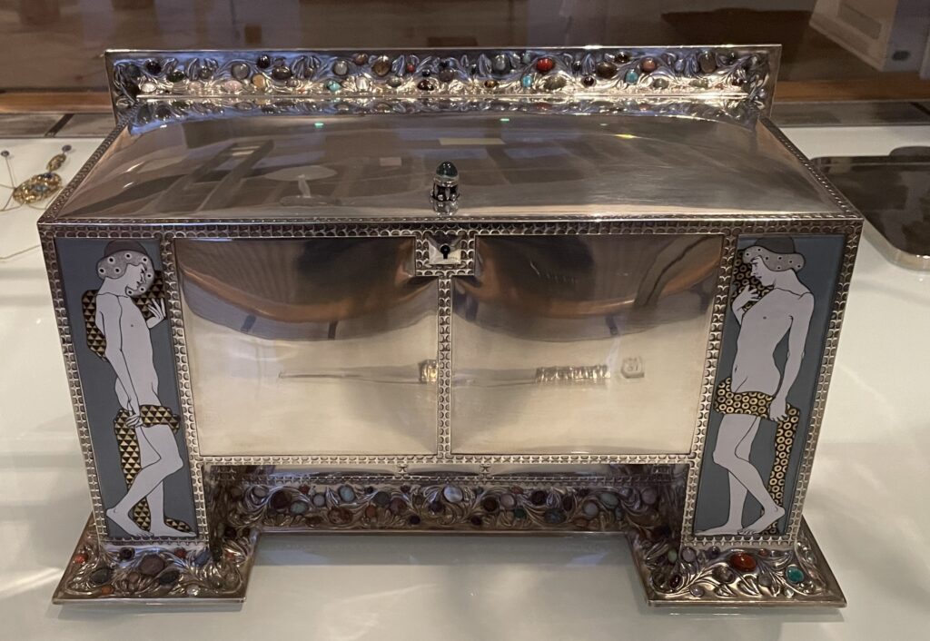
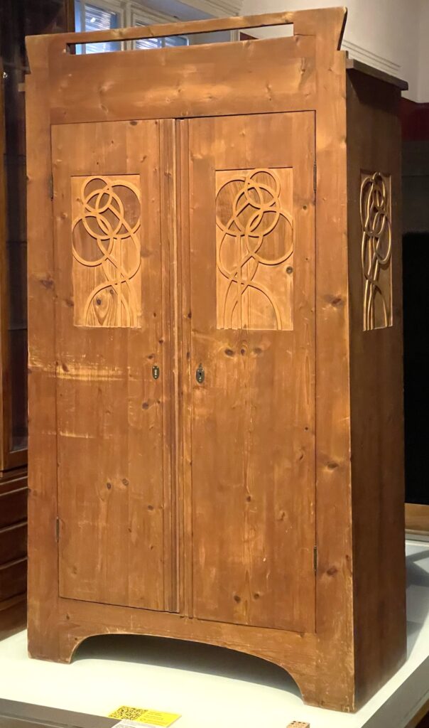
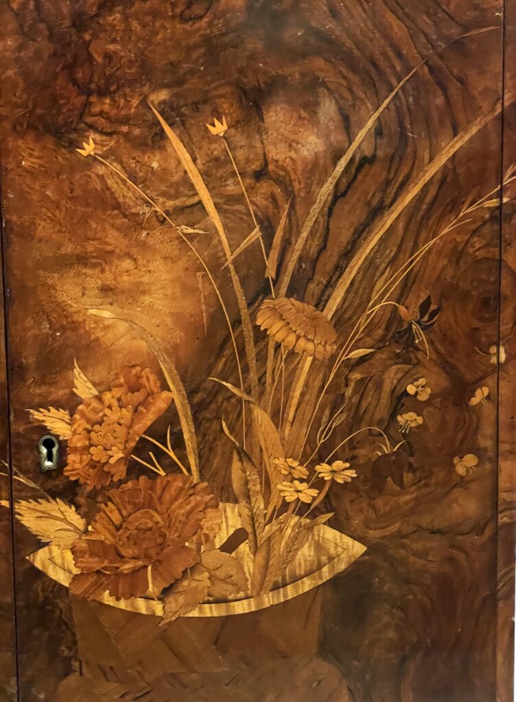
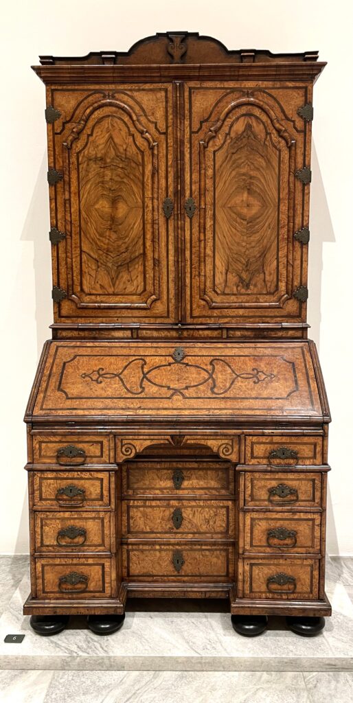
Of all of the applied arts museums in the World the one I visited last month was the MAK in Vienna, Austria. MAK is Museum für angewandte Kunst, translated to applied arts. Vienna was a hotbed of modernist ideas around 1900, and home of the Wiener Werkstätte, similar to the workshops established by Morris and his friends in the 1880’s in England. The Museum has an extensive collection and small and furniture sized items and art and paintings by Gustav Klimt and Margaret Macdonald Mackintosh from this period.
Unlike many museums in the US and other parts of the world, the pieces at the MAK are not behind glass, so you can get up very very close. Though mostly the museum staff were focused on watching my four-year-old granddaughter and her clear desire to touch absolutely everything (we made it, she didn’t succeed,) I did get into cautious conversation with a docent who came across me laying down taking photos as best I could underneath a cabinet without setting off alarms. They allowed me to carry on.

Who is this Roentgen guy anyway?
Marquetry has a long and storied history, known to those who inquire, but it’s not in the core curriculum. It developed in parallel to the extraordinary furniture that was created from 1600 onwards to cater to the wealthy nobles and gentry of Western Europe. Furniture was one of the ways that the wealthy could flaunt their status. Royal furniture set the standard, and those lower in the wealth chain did their best to emulate those above them. Makers of all kinds had free reign to develop or copy stylish items, and they did, with varying degrees of success.
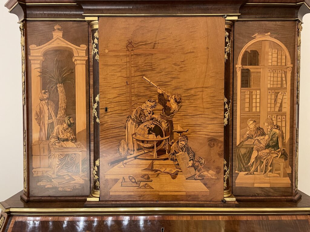
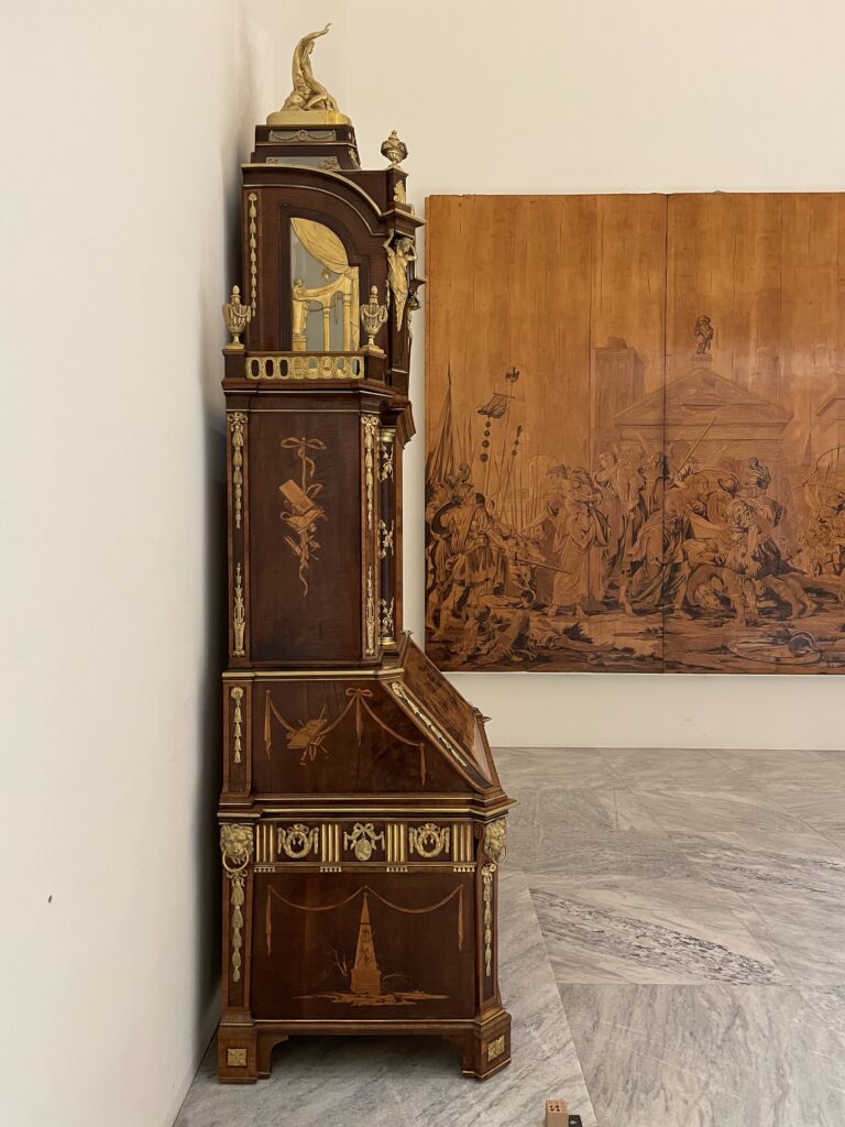
A few of those makers had technical and marketing expertise to raise them above the rest. David and Abraham Roentgen were a father and son team of craftsmen whose substantial business in Neuwied (Germany) created mechanically marvelous furniture covered in exquisite marquetry. Their furniture was sold to royalty from Russia to France to Austria, and everywhere in between. Most is scaled for palaces. The Roentgens had many employees, specialists who designed and made the most costly and complex furniture seen, at astonishing cost.
This era of unlimited wealth and consumption was ended by the French revolution and the Napoleanic wars that followed. Many of the techniques were retained in France, and can be seen most clearly in Napolean III (1850’s) and then Art Deco (1920’s) furniture.
The technical virtuosity of the finest furniture made from 1750-1790 appeals to me greatly. It shows what happens when cost is no object. Afterwards cost constraints reduced the frothiness somewhat but the skills previously developed were applied to uplift items. I recognize that the costs of those objects were borne by others who didn’t get to enjoy them, but the objects themselves are not the guilty party. The craftsmanship speaks for itself, and should be appreciated for what it is.
The Roentgens, along with Oeben and Riesener in Paris, and Chippendale and then Hepplewhite in England, are at the top of the heap. Their virtuosity provides inspiration to anyone who studies it, no matter what the application.
If you would like to learn more about the history of marquetry, Silas Kopf’s book My Marquetry Odyssey (ISBN 9781555952877) is a good place to start. To read about the Roentgens, Extravagant Invention, the Princely Furniture of the Roentgen’s by Koeppe (ISBN 9780300185027) is an excellent and exhaustive study. Both of these books are out of print but are available used or from libraries.
Tech(nique) Topic: Where do design ideas come from?
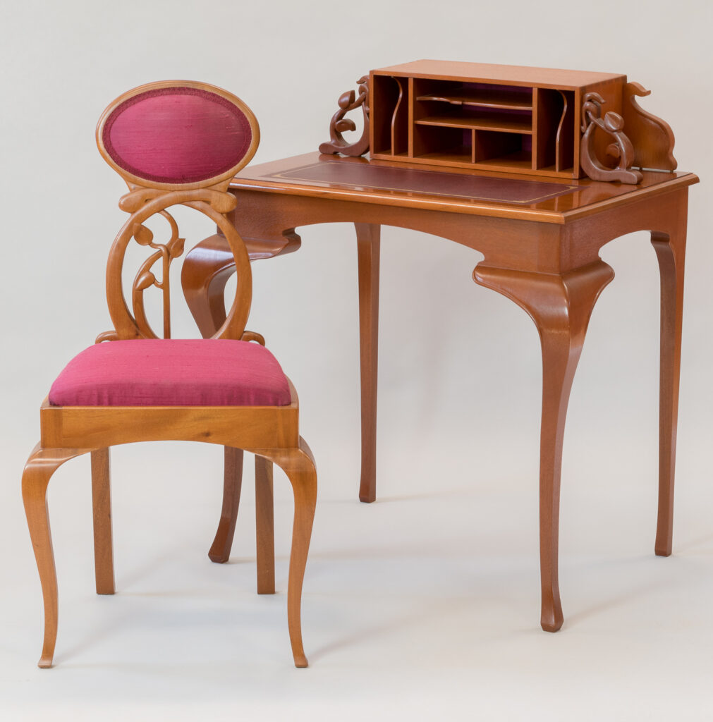
Jenn here, to talk about working through the achilles heel of many designers and furniture makers: where to start for design inspiration.
As a designer when you’re working for a client, sometimes (but not always) the client supplies a design direction as part of the brief, or at bare minimum the function of the object you’re being asked to create. But when the client is you, or the possibilities are left very open-ended, how do you begin?
When it comes to furniture, many woodworkers and especially those who believe they struggle with design tend to trip themselves up for the same reason: they start a piece thinking about how to make it, rather than what they want it to look like. Of course function is super important, and the technical aspects of construction are pretty critical to ending up with a usable object, but as an architect I am the unusual combination of someone who believes both function AND aesthetic should be honored in a truly great piece. If you let function drive the bus, you’re missing an opportunity to push yourself to something great.
When you begin thinking about the aesthetic quality of your piece, begin with adjectives or responses you wish the piece to evoke. These words don’t necessarily have to relate to furniture or styles, unless you know something specific about the design direction. Some examples: graceful, solid, traditional, sleek, light, minimal, showpiece – these are all ways to think about and help define the characteristics you want to design towards and where you should look for inspiration. If I wanted a minimal and sleek cabinet, I would not go looking at Jacobean casework furniture as a precedent, but if I were looking for a solid and impressive dining table for a large room I just might.
Once you have a feel for the personality of your piece, you can search for the inspiration that feels like a best fit for you to study and be inspired by. Having a large collection of books at your disposal helps, but a single trip to the library or a good used bookstore can help you hone in on designs and time periods that spark your interest.
You can use a basic web search, or often more helpfully Chairish and 1st Dibs to help understand how other people define or name elements that really inspire you – I do this all the time to help me clarify my search terms and bring up really specific examples. With the digitization of so many museum collections, there is a tremendous amount of information within reach if you know how to describe what you’re looking for the way it is catalogued online. For example, I was heavily influenced by my visit to Musee D’Orsay and the Mucha museum in 2006, a full year before designing my desk and chair shown above. After I got back to my school library, the best images I had to work from were grainy black and white photocopies of furniture displayed at the 1900 Paris exhibition – now a simple Google Image search brings up dozens of high quality images.
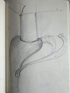

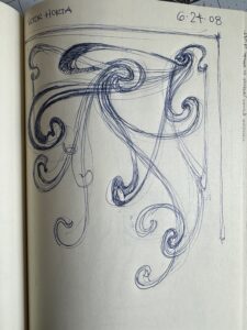
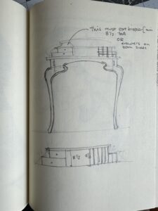
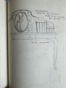

From there, start sketching! Pull in elements from pieces that really inspire you and begin to think about the constraints of function and construction technique, but don’t let it consume the design. As you sketch, you should check back in with your piece’s personality and confirm the direction you’re going feels appropriate to that. Once you have started in a direction that you feel good about, you can begin refining the details and construction methods.
Hope you found this design-heavy edition helpful!
return to the running with chisels archive
return to top
©️ 2025 Heller & Heller Furniture | Privacy Policy | Terms